Paid Ad Graphics: 8 Layouts That Work in Meta Ads
The short answer
Most paid ad graphics that perform reuse a small set of structures. You do not need a new idea every time. Pick one structure, put one message into it and make the headline readable on a phone. Below are eight structures, each with a wireframe, a use case and a build recipe, plus three structures for carousel ads.
Five rules before any layout
- One message per ad. A second message belongs in a second ad.
- Headline first. Five to eight words, set large, in the top half.
- One focal point. The eye needs one place to land.
- Contrast you can measure. Text needs at least 4.5:1 against its background, the common accessibility threshold for normal text. Postd's contrast guard checks this while you type.
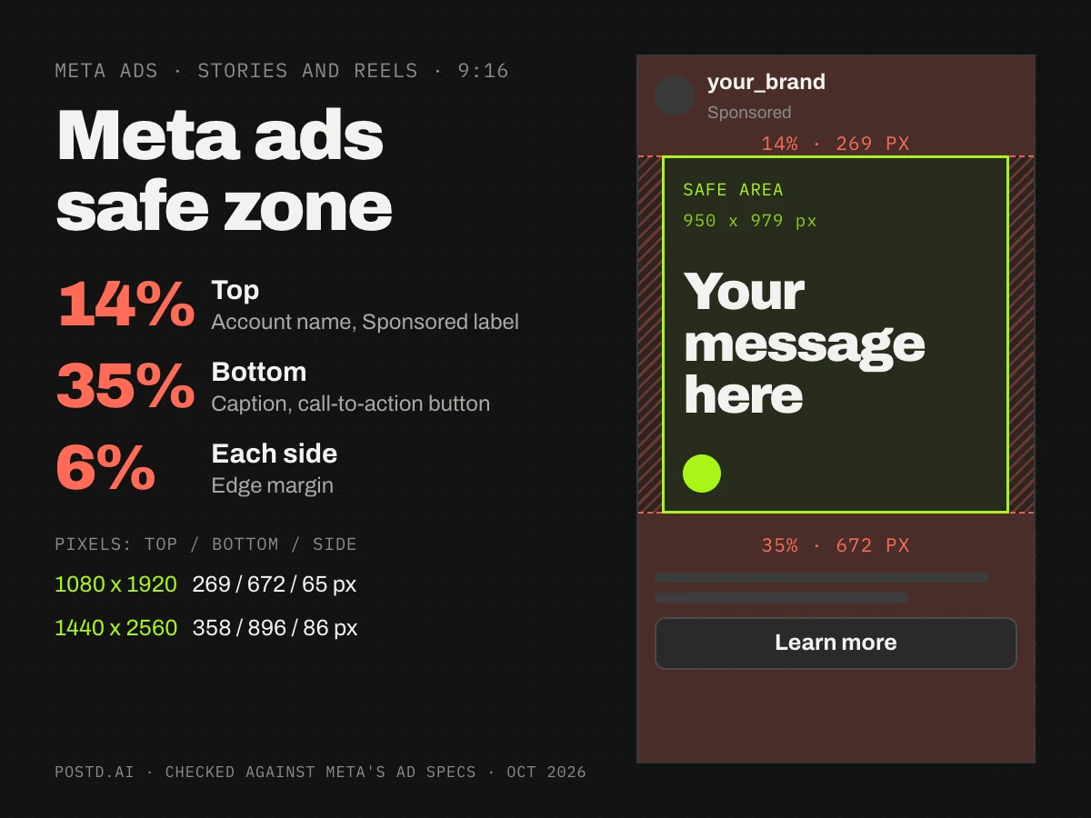
- Room for the interface. In 9:16, keep the top 14 percent and the bottom 35 percent clear. The sizes guide has the pixel values.
Eight layouts
1. The offer
A big number or price is the picture. Use it for sales, launches and limited-time deals.
Build: the number takes about a third of the canvas, one line explains the condition, and one small button-style label closes the ad. Avoid: two offers in one ad, and fine print below 36 pixels.
2. The product on a plain background
One cut-out product photo on a solid brand color, with one line of text above it. A calm layout for people who do not know you yet.
Build: cut out the background, center the product, put the headline in the top third and the price or a button label at the bottom. Avoid: busy backgrounds and shadows that fight the text.
3. Social proof
A real quote, a row of stars and a name. Use it for services and software, and for people who have already seen your product once.
Build: set the quote in two or three lines at 60 to 80 pixels, draw the stars as shapes and put name and role small below. Avoid: invented reviews. Use words a real customer wrote, with their permission.
4. Before and after
Two images with the same crop and the same light, labeled. Use it when the result is visible in a picture.
Build: a two-cell collage, labels in the corners, one headline below. Avoid: results you cannot prove. Meta restricts before-and-after images in some categories, health and weight loss among them, so read the Advertising Standards first.
5. Feature callouts
The product in the middle, three labels around it. Use it for products and apps with features worth pointing at.
Build: labels at 36 pixels or larger, thin lines, three callouts at most. Avoid: lines that cross each other.
6. The comparison
Two columns, the old way against the new way, three rows. Use it when your reason to switch is easy to list.
Build: give your column the brand color and use one short phrase per row. Avoid: claims you cannot support.
7. The benefit list
A headline and three benefits with checkmarks. Use it for services with several selling points.
Build: three rows, an icon and one short line each, a button label at the bottom. Avoid: a fourth row.
8. Type only
A solid color and one big sentence, no photo. Use it to test hooks quickly, because a new version takes minutes.
Build: six to ten words at 120 pixels or larger, two colors, a small logo. Avoid: body text under the headline.
Three structures for carousel ads
A carousel ad takes 2 to 10 cards in one ratio. Card one has to stand alone, because it is the only card many people see. The last card carries the call to action.
- The story: card 1 hook, card 2 problem, card 3 solution, card 4 proof, last card call to action.
- The showcase: one product or feature per card in the same layout, the offer on the last card.
- The panorama: one image runs across the card edges, so people swipe to see the rest. Cut the image at exact multiples of the card width, for example 3240 x 1080 pixels for three square cards at 1080 x 1080, or the seams show.
The safe choice for a carousel that also runs on Facebook is 1:1. Instagram also takes 4:5 image cards. A ten-card carousel needs a Pro account in Postd, because Pro lifts the limit to 20 slides.
Sizes that hold up on a phone
| Element | On a 1080 pixel wide canvas |
|---|---|
| Headline | 80 to 140 pixels |
| Supporting line | 40 to 54 pixels |
| Smallest text | 36 pixels |
| Margin to the edge | 54 pixels or more (5 percent) |
| Logo height | 60 to 90 pixels |
| Contrast, text to background | 4.5:1 or higher |
A phone shows a 1080 pixel image at about a third of its size, so 36 pixel text lands near 13 points on screen. These are working values, not Meta rules.
Building these in Postd
Set the brand once, with colors, fonts and logo, and every layout picks it up. When you change the brand later, existing slides follow. The logo has six fixed positions, collage cells give you the before-and-after split, background removal gives you the product cut-out, and the contrast guard flags text that is hard to read. Export 4:5 and 9:16 as JPG.
Postd has no prompt-to-image generator. You bring the photo, and Postd gives you the layout, the brand, the checks and the export. It does not connect to Ads Manager, so you upload the files yourself.
FAQ
How much text should a paid ad graphic have?
As little as the message allows: a headline of five to eight words and at most one supporting line. Meta no longer enforces its old 20 percent text rule, but short text is still easier to read on a phone.
What font size works for Meta ads?
On a 1080 pixel wide canvas, 80 pixels or more for headlines and 36 pixels as the smallest text. A phone shows the image at about a third of its size.
Can I use the same graphic for Feed and Stories?
Not without checking. A 9:16 version needs the bottom 35 percent and the top 14 percent free of key elements. Make a second version instead of stretching the first.
Should a paid ad always have a photo?
No. A photo gives you a focal point, and a type-only layout gives you speed. Test both.
Next
Sizes: Meta ad sizes and creative assets. Setup: how to create Meta ads. Tools: Meta ads generator. To try a layout, open the editor; plans are on the pricing page.